Maverik is a fast-growing, brand-forward convenience retailer with more than 400 stores across the western U.S., and their locations are designed to feel intentional, modern, and unmistakably on-brand. For us, this featured project was not about a one-off install that looks great in a photo. It was about repeatable execution at scale, delivering consistent wall graphics results across many environments without turning each location into a custom science experiment.
What this project was really about is consistency at speed. Each store has its own footprint, traffic patterns, and on-site realities, but the customer experience still needs to feel cohesive from location to location. That means standardized placement, clean alignment, and dependable finishes that hold up under bright lighting and constant foot traffic.
Across multiple sites, our focus stayed the same: follow a repeatable installation approach, maintain quality control, and deliver reliable results customers notice without realizing they noticed.
The Goal: An Immersive, Regional Feel With Brand Consistency
Maverik’s growth and rebrand momentum creates a simple requirement: every location has to feel like the same brand, even when the buildings are not identical. As CSP has reported, Maverik has been executing large batches of rebrands in Colorado as part of a broader effort to unify stores under one brand experience.
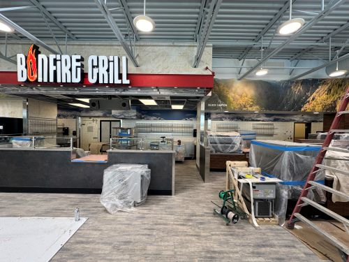
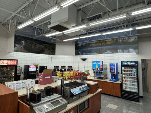
For this project, the wall graphics were not treated as decoration or filler. They were treated as commercial wall graphics that support the environment customers move through, so each store feels immersive, region-aware, and consistent from one stop to the next.
What the Graphics Needed To Deliver
Customers should feel oriented quickly, especially in a convenience environment where decisions happen fast. The space needed to look intentional, not pieced together from random elements.
- Reinforce brand identity across high-traffic interior zones where people naturally pause.
- Turn transitional areas into part of the experience instead of dead space.
How “Regional Feel” Shows Up Without Overcomplicating It
A regional feel does not require a mural-sized history lesson. It can be subtle, like local cues, outdoor-adventure tones, and graphics that make the space feel connected to the community while still landing as clearly Maverik.
Scope and Standardization Across Multiple Locations
Maverik’s Colorado rollout was not a single “hero install,” it was repeat work across many stores with the expectation that every finished wall would look like it came from the same playbook. CSP has reported Maverik’s Colorado rebrand push and noted the effort would bring the company to operating more than 124 stores in the state after completing a large batch of rebrands.
For us, the core story is scale without slippage. Commercial wall graphics only work at this level when the execution stays consistent even as site conditions change.
How We Keep Multi-Site Work Consistent
We treat repeat installs like production work, not one-offs. That means documented standards, predictable sequencing, and the same quality checks at every location.
- Standardized placement and alignment so the design lands consistently.
- An install process built for speed and cleanliness in real-world conditions.
What Standardized Execution Looks Like On-Site
Different wall conditions and traffic patterns are expected. The finished result still needs to read the same: clean lines, consistent seams, and brand-true placement.
On-Site Challenges in Active Retail Environments
Convenience retail is a live workspace, not a controlled jobsite. Customers are coming and going, staff are stocking and cleaning, and the store still has to function normally while the work gets done.
That reality changes everything about installation. Our approach has to be fast, clean, and respectful of operations, while still delivering commercial wall graphics that look intentional up close and consistent from store to store.
What We Had To Work Around
These locations are not empty shells. They are active environments with “objects that matter” already living on the walls, and every one of them affects layout, alignment, and flow.
- Doors, signage, TVs, shelving, and restroom fixtures all create cut points and visual interruptions.
- Tight timelines mean limited windows where disruption is acceptable.
- Bright lighting and reflective surfaces can make small imperfections easier to spot.
Why These Details Matter
A great design can still look wrong if it lands crooked around a door frame or competes with existing signage. Precision is the difference between branded and busy, especially in high-traffic areas where people are viewing the walls from just a few feet away.
How Wall Graphics Turn Utilitarian Space Into Brand Experience
A convenience store has plenty of spaces that exist purely for function. The difference is whether those areas feel like leftover square footage or part of a designed environment customers move through with confidence.
When we install commercial wall graphics in these zones, the goal is not to add “more stuff” visually. It is to create coherence, reduce visual noise, and make the store feel intentionally built from front to back.
Where the Biggest Impact Shows Up
Functional zones are often where the brand disappears. Bringing them into the same visual system makes the whole location feel more polished and more complete.
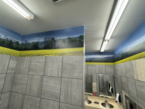
- Back corridors and transitional areas start to feel purposeful instead of forgotten.
- Restrooms and service zones become consistent with the look and tone of the store.
- Plain walls stop competing with random notices and start supporting the overall experience.
The Outcome Customers Feel
Most customers will not pause to admire a wall. They still register the environment subconsciously, and that shapes perception fast.
A space that feels newer, clearer, and aligned with the brand tends to feel higher quality. It also feels easier to navigate, which is exactly what you want in a high-traffic store where decisions happen quickly.
Why We Are a Trusted Installation Partner for Projects Like This
Projects like Maverik require more than good design. They demand an installation partner that understands scale, consistency, and the realities of working inside active retail environments. At Denver Graphic Installers, we are a dedicated graphic installation team, built specifically to execute complex, repeatable installs without sacrificing quality. Our experience and certifications allow us to work efficiently while still delivering finishes that look intentional, polished, and on-brand at every location.
Brand consistency does not happen by accident. It is the result of disciplined execution, clear standards, and installers who understand how design translates to real walls with real constraints. When installation quality slips, even strong graphics can look patched or temporary. When it is done correctly, the graphics feel permanent, aligned, and premium.
What We Bring to Multi-Location Rollouts
We are structured for repeat work and high standards, which matters when dozens of installs need to look identical under bright lighting and constant foot traffic.
- Installation precision that protects the original design intent.
- Consistent finishes across locations so the brand reads as unified, not fragmented.
For growing brands, the takeaway is simple: the install partner is just as important as the graphics themselves.